Five Things Marketing Teams Should be Doing During the COVID-19 Shutdown

The Covid-19 pandemic seems surreal and straight out of a science fiction scenario. However, as a wise person said, “It is during our darkest moments that we must focus to see the light.” As we struggle to adapt to the realities of shutdowns, shelter-in-place, work-from-home, or closed-for-business scenarios, remember that shutting down all marketing activities can become a liability when our lives go back to normal. You want to be prepared to ensure top-of-mind brand awareness when demand resurges. So, gather your energy and focus on tasks that can help you help your customers today and tomorrow when the clouds give way to sunshine.


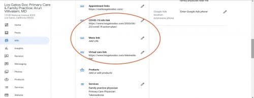
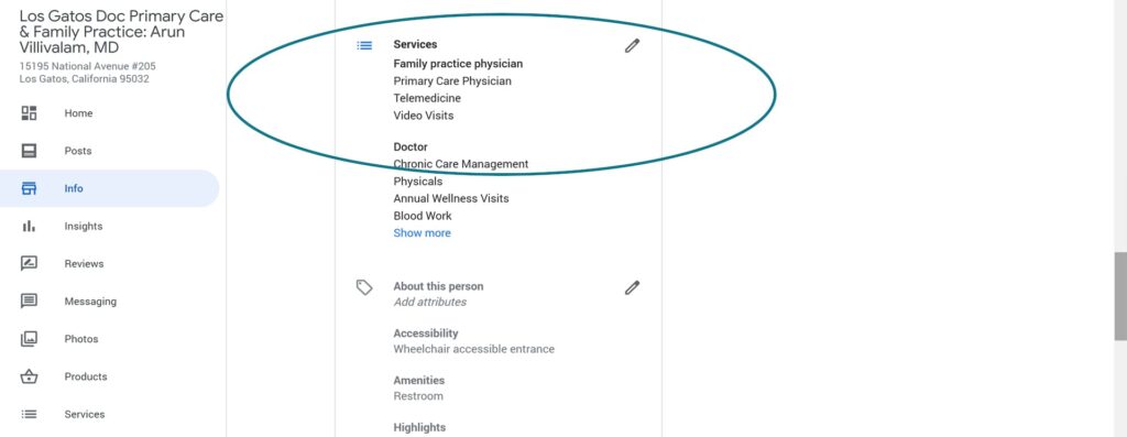
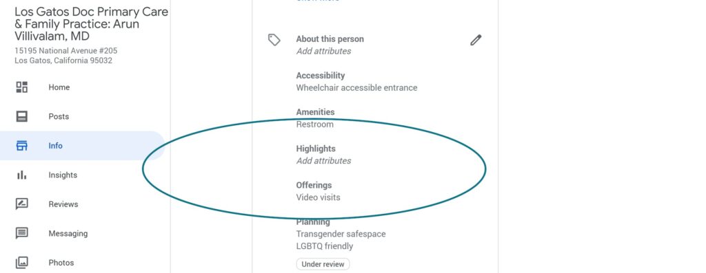
  1. Communicate with your customers – Intimate your customers about what they can expect from your business. Are you shut down for business? Are you open for business virtually? Or is it business, as usual? Pick up the phone and contact your customers. Post updates on your website and social media channels. Create a video with updates and send it to your clients via email – a personalized message works wonders and your customers will be relieved to hear your planned approach directly from you or your team.We recently created a COVID-19 communication plan for our healthcare client, helped them transition to online visits, and then reached out to their patient base as well as prospective audience to let them know about their new service. As part of the communication plan, we designed visuals, videos, door signs, updated the website with updated content, created Q&A documents, and communicated through all owned and earned channels.
  1. Study successful competitors –A slowdown is a perfect opportunity to examine how industry leaders and competitors create unique value propositions as well as business growth strategies and reevaluate your own against those. Is there something you could learn about product positioning, pricing, promotional strategies, places they operate in, and the way they manage their people. Shutdown is a perfect time to reassess your business strategies. A business-savvy client of ours, who operates a transportation logistics and luxury transportation service, is studying how Uber managed to come a long way from being a cab aggregator in 2009. And what better time to adjust your strategies than during a downtime when you have the luxury of time on your side?


  1. Evaluate your content strategy – No matter which vertical you are in, content is the king of marketing and consistency is the queen! So during the slowdown, take a step back, reassess buyer personas, funnel strategy, and content pieces that plug into the funnel. Pull your email, paid and social engagement numbers to see what’s worked in pulling in leads and sales. Channel efforts that work better than others. Repurpose old blogs that got you traction in the past. Here are 5 strategies on how to repurpose old content.


  1. Build Proof Points – This current crisis will pass. Prepare so you can put your best foot forward when customers begin seeking products and services. Collect data, get testimonials, and create case studies. Create brand videos that tell your story. Create product demo presentations that will fuel your sales. You may not be inclined to investing in a full-scale website rehaul but certainly consider updating your website with current content.


  1. Continue to create brand affinity content and stay active on social media – This may not be the best time to market your products or services. Focus instead on building your brand voice and brand awareness. Inspire people to dream about the future. Ask your customers to create wish lists that you can incorporate into your offerings. Finally, leave them with positive vibes.


As Haruki Marukami said in Kafka on the Shore:


And once the storm is over you won’t remember how you made it through, how you managed to survive. You won’t even be sure, in fact, whether the storm is really over. But one thing is certain. When you come out of the storm you won’t be the same person who walked in. That’s what this storm’s all about.


So be transformed and be ready when the storm passes. Because it will.


Let us know how your marketing team is doing during the COVID-19 crisis to be prepared for the present and the future!

Healthcare Digital Marketing: What E.A.T. Means for Your Search Visibility and Why Good Content is Your Best Friend!

In 2018 Google unveiled its “medic update” which had strong implications for businesses in the YMYL (short for ‘Your Money or Your Life’ or in other words websites that provide any information that affects people’s health, wellness, or money). Since more than 40% of websites affected due to this update were health related sites, this came to be known as the “medic update.” There have been further Core Quality Updates in 2019 that continue to have deep implications for search visibility of healthcare organizations.

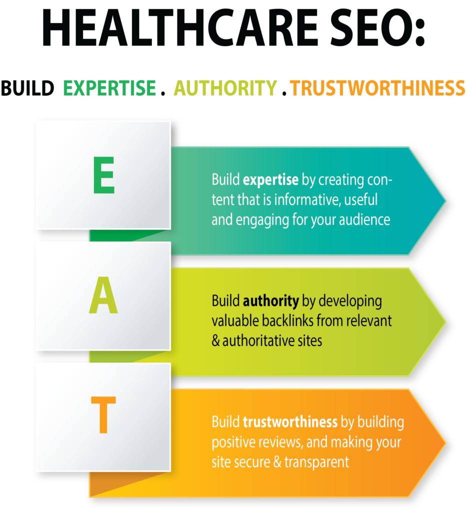
So what do these updates mean if you are a healthcare provider? Put simply, it means that Google does not want to recommend “uneducated advice, opinions, or potentially fraudulent websites.” Google wants to be certain that the sites that they recommend display a high level of expertise, authority, and trustworthiness.

So how do you signal your expertise, authority, and trustworthiness to Google?

Expertise

  1. Build expertise by creating frequent content that is informative, useful and engaging for your audience.
  2. Remove poor quality, dated content from your website that would signal half-baked, incorrect, or worse, harmful information to your audience.
  3. Keep in mind that it is not only important to build E.A.T. for your website, but also work on building E.A.T. for your content creators. How?
 

  • Ensure your content creators are experts in healthcare. Google has indicated that “medical advice needs to be written by people with high medical E-A-T to be considered high quality.”
  • You may be a wonderful and experienced doctor, but if you haven’t built your online profile then there is nothing in the digital world to back up your expertise. So strengthen your online expertise by writing guest articles for niche publications in your field and contribute to industry publications and forums.
  • Add by-lines expert to website content. This will signal that the author is an expert in the profession or niche and the information provided in that blog is trustworthy.
  • Link content creator’s profile to other online profiles, especially on authority sites.
  • Use structured data to markup the author’s profile that will allow for a connection to be made with other online profiles for the author.
  1. Cite credible research, statistics, and data in the content that you create.


Authority

  1. Build authority by developing valuable backlinks from relevant & authoritative sites.
  2. Gain backlinks from high authoritative sites naturally by guest blogging for niche high DA (domain authority) sites. Most health-related guest blogging sites have clear guidelines on the types of content they will consider for publication. Identify sites that are the best fit for your specialty.
  3. Create outbound links to high quality health sites & industry publications. Try to include links to research studies or academic journal. Outbound links to .edu or .gov or .org sites are especially useful.
  4. Quality over quantity! Take your time to build good quality links. Building links through automated citation submissions may not be enough anymore.
  5. A good social media strategy will help you market your content and get your content shared – another great way to build authority.

Trustworthiness

  1. Build trustworthiness by building positive reviews. Positive client reviews help in increasing the E.A.T. score, so encourage all the satisfied patients to write testimonials on Google My Business, social media, and review sites.
  2. Many healthcare provider websites allow for email subscriptions, online appointment scheduling, online portal sign-ins etc – all considered to be Protected Health Information (PHI) under HIPPA. This patient data is vulnerable to being stolen unless your site is secured with an SSL certificate. An SSL certificate is not only necessary for you to be HIPPA compliant, it also signals trustworthiness of your website. Google takes privacy of user data very seriously and provides a boost to those websites that signal their intent to protect their user’s information. So make sure your website is secure with an SSL certificate!
  3. Have a clear way for your visitors to contact you with a clearly accessible Contact page.
  4. Include a Privacy Page to let your patients know how you gather, use, disclose, and manage their data.
  5. If you allow for online transactions through your website, ensure that clearly outline your refunds & returns policy.


E.A.T. is not the only update that has had an impact on Google search rankings of healthcare businesses. The 2019 B.E.R.T. is another update that has hit some healthcare sites hard and is about incorporating Natural Language Processing (NLP) into Google searches. And if pages on your website don’t provide information on topics that users are keying into search bars, then your website is likely to be overlooked.


Note the common theme in all the updates? Create content that is informative, useful, and engaging. Google has been saying this for a very long time. Create great content. That has not changed and will not change. See how we used content creation and a solid digital marketing strategy to help a healthcare practice gain top search visibility, increase online patient lead generation, and grow their long-term patient panel 60%.

[mk_page_title_box page_title=”Healthcare Digital Marketing Done Right” page_subtitle=”Grow Quickly & Effectively” section_height=”150″ font_size=”24″ title_force_font_size=”true” sub_font_size=”16″ subtitle_force_font_size=”true”]

Make Your Higher Ed Website Modern, Personal, and Effective by Avoiding These 10 Costly Mistakes

In working with various higher education providers and legacy institutions, we have come to learn that websites have emerged as the leading tool in the admission and marketing toolkit to draw in prospective students especially qualified students who will also tend to retain better with positive academic and career outcomes. In that sense, the website is the first point in the virtuous circle of lead to advocacy.


Students are increasingly using the web to evaluate and choose a college. However, despite the critical role that websites play in their ability to drive choice, higher ed websites are notorious for being clunky, impersonal, and confusing. Part of the problem is higher ed websites tend have sprawling site architecture with thousands to sometimes millions of pages. Bringing order to the sheer size of the site can be daunting task, not to mention the multiple user behaviors and preferences that the site must cater to. The mistakes, however, are easy to spot. Here are ten most common mistakes that higher ed website redesign teams tend to make:

[mk_padding_divider]
  1. Over focused on Admissions and Enrollment– Websites for higher education are increasingly driven by the enrollment team and are overly focused on their applications and enrollment goals. Prospects on the other hand are thinking beyond admissions into student life, co curricular and extra curricular opportunities to get a glimpse into student life. Websites are woefully lacking in delivering content and user experience that a prospect can use to imagine his/her life at the college.


Who Got it Right? Not all high-ed websites fall into the trap of admissions and enrollment goal overzealousness. The Johns Hopkins website does a commendable job of not only telling their ‘brand story’ but also highlight school philosophies reinforced through student profiles.

[mk_padding_divider]
[mk_padding_divider]

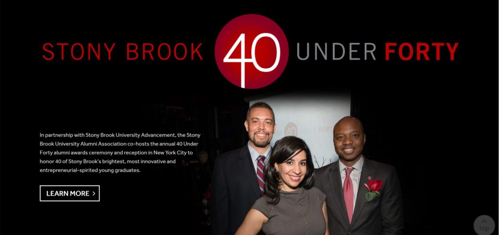
2. End game focus is here to stay– Only a handful of the 20,000 or more higher education websites really address the “What will be life like after I graduate” question.  Only a few provide program specific career links and current data from BLS and other projections. The alumni tab is not enough to provide students with a look at their future selves!

Who Got It Right? Stonybrook, North Central College and the University of North Carolina School of the Arts do a great job of highlighting Alumni profiles to prop up post-university opportunities.

[mk_padding_divider]

3. Mind over heart – Webtage’s audit of over 100 websites showed a shocking lack of emotion and personal touch. How about a professor or a counselor making a personal connection through the site? Students want to study from and spend time with people not institutions!

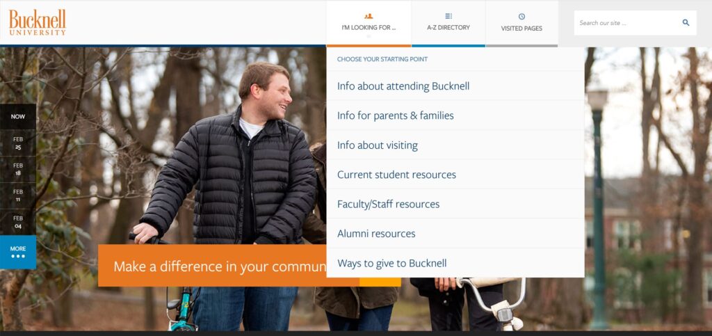
  1. Who Got It Right? Bucknell, one of our favorites, got it right by putting faculty voices front and center on their home page.
[mk_padding_divider]

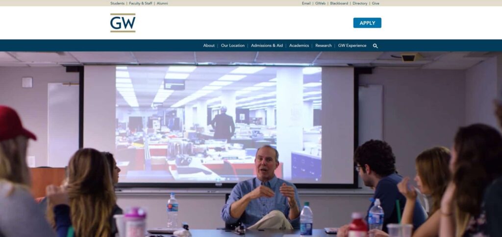
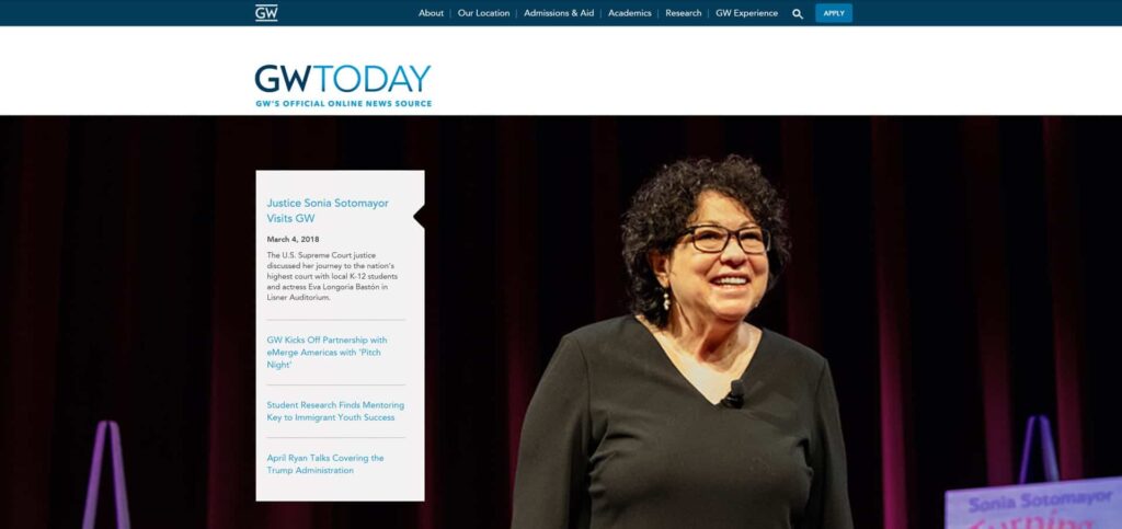
George Washington University also offers a personalized experience through wide-shot and close-up videos and images of faculty and honorable guests.

[mk_padding_divider]

4. Lack of simplicity/transparency – Many college websites bury answers to the top 5 questions relating to admissions, cost of attendance, outcomes, student life and graduating requirements in such a complex maze of content instead of tackling these in a transparent and straight forward manner.

Who Got It Right? Bucknell University made the cut again. We’re very impressed by Bucknell University’s navigational ease in providing sought-after information to audience segments.

[mk_padding_divider]

5. Comprehensiveness over user experience: Website for a lot of colleges are over a 1000s of pages deep!! This is in total contrast to the twitter culture where consumers expect to find information/form an impression in as little time as possible. The worst sites are the legacy sites which have simply added on more content as needed sacrificing the user experience completely. It is risky to assume that “if they need it, they will find it” is a way to define user experience.

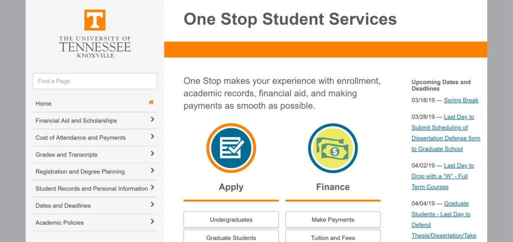
Who Got It Right? The University of Tennessee at Knoxville One Stop Student Services uses a simple layout and unadorned navigation to provide a wealth of information to students


[mk_padding_divider]
[mk_padding_divider]

6. Tradition versus dated : The age of the college doesn’t have to show on the website user experience! A 200 year old college does not have to offer a “dated” user experience to communicate the tradition and experience.

Who Got It Right? The 273 year old Princeton University has a website that is fresh, clean, and modern and still packs a punch by giving viewers a clear sense of their ethos, their commitment to keeping up with the times, and a ton of key information neatly organized.

[mk_padding_divider]

7. Foggy pathways: For colleges that have programs that lead to licensure/certification –  it is a missed opportunity to not show the pathway to achieve that licensure.  Many progressive colleges are now including the steps to the licensure in their program/service so that they are a one stop shop.  Short of that, at least the websites can provide clear pathways and third party links that can bridge the knowledge from graduation to certification.

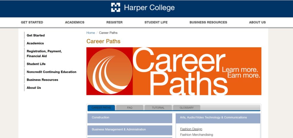
Who Got It Right? Harper College, in our neck of the woods, has created a simple and simple and easy to navigate career pathways landing page for its students. We love the interactivity it offers in contrast to the text-heavy career pathways page on most other higher ed sites.


[mk_padding_divider]
[mk_padding_divider]

8. No (N) traditional students: Almost all colleges want the non traditional students for their onsite or online campus but the websites are an extension of their lack of clarity on what these students want and their barriers/anxieties. Many websites just use diverse student images to satisfy themselves that their site addresses the non-traditional student but the reality is that these students have very distinct concerns and anxieties.

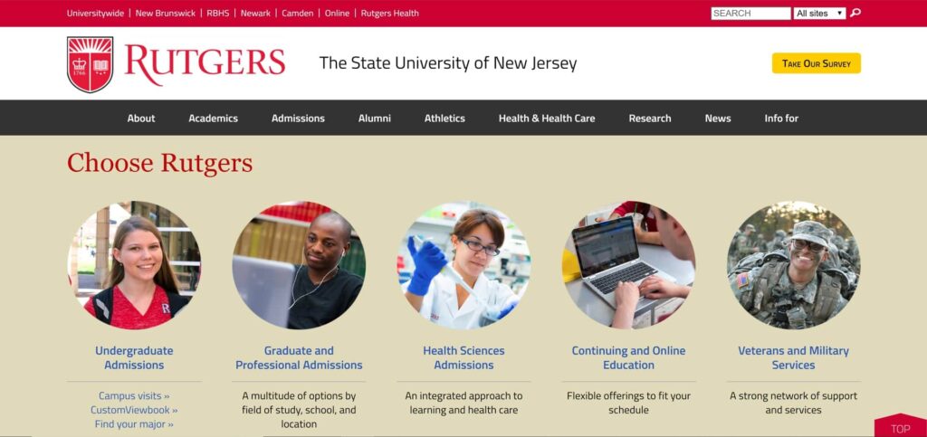
Who Got It Right? Rutgers has a spotlight on their active military/ veteran students as well as continuing education and online programs on their home page that allows for good targeting and intuitive self-segmentation for the non-traditional students attending a traditional university set-up.

University of Maryland at University Campus also does a great job with a landing page for military/veteran students with a lot of useful information organized neatly into a side navigation.

[mk_padding_divider]

9. Underleveraged Assets: Any college or university has faculty or other assets that could be powerful in search engine optimization ( SEO) but because these are not tagged properly or recognized, they remain under-utilized.


[mk_padding_divider]
[mk_padding_divider]

10. Lack of enough program level differentiation: Most universities are beginning to answer the question “why them” and develop a somewhat distinct identity/voice. However at the program level, higher education is becoming increasingly commoditized. The website is a great place where using the Less is more principal- the program can be differentiated in how its CLO or PLO are defined or how the capstone project is to be completed. Typically, we work closely with the Dean or the Program Director to define the program level positioning.

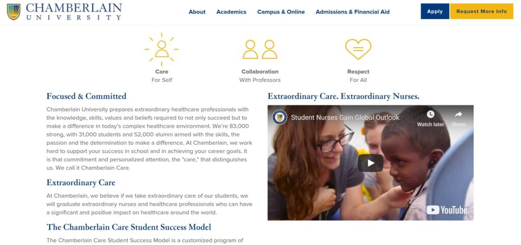
Who Got It Right? Chamberlain College of Nursing has well activated its program positioning on its website through effective brand voice, content development around careers, spotlight on nurses and tips for students.


[mk_padding_divider]
[mk_padding_divider]

Redesigning a higher education website is a more than a technology migration or marketing communications initiative. It is truly about delivering a user experience that is relevant and compelling enough to drive choice and ease of use for all users.


Which higher education websites do you like and why? We’d love to hear!

[mk_padding_divider]
[mk_padding_divider][mk_circle_image src=”https://www.webtage.com/wp-content/uploads/2017/02/Webtage-2017.png” image_diameter=”150″]

We are an award-winning digital build and market firm that brings a research-based approach, technical sophistication, marketing ingenuity, and creative thinking to innovative web solutions that bring consistent returns on digital investments.

Our digital build & market experience spans multiple industries, but our strongest strengths are B2B/technology, higher education, healthcare, B2C, and professional services. Our clients achieve sustained visibility because we build online campaigns the solid way.

How to incorporate storytelling into B2B content creation?

While it is said that B2B buyers make decisions based solely on price and profit potential alone, even Ebenezer Scrooge succumbed to his amazing life story being shown to him through the eyes of the spectres! The most hardened number cruncher among us can’t resist a good, relevant story.

On average, 4% of people will remember any facts or figures from their last Power Point presentation. Most of us dread meetings as nothing more than ‘yawn fests’ that drone on seemingly forever.

These days we can consume up to 100,000 digital words every single day. Studies show that people prefer to get their information in the form of stories, not having statistics and lists of facts thrown at them.

If we are listening to a story about climbing a tree, the parts of our brain that would activate if we were actually climbing a tree in real life, light up. Telling a story is a powerful way to communicate and reach clients in a meaningful way.

Sometimes all you need are a few powerful words to engage. Ernest Hemmingway has been attributed to this six- word short story that is hinting at or implying a much larger story:

For sale: baby shoes, never worn.

A story need not be novel length. A good story can be a just a few words. When you know your audience, when you want your brand to resonate you can tell a story. Stories will not only inform and teach but they will be remembered as well.

[mk_padding_divider]

Elements of B2B Storytelling

The heart of B2B marketing lies in building lasting relationships based on mutual trust. What better way to connect with the humanity of potential customers than with a story? Stories are how we learn. Stories can convince. Stories teach. Stories entertain. In the end, stories build relationships.

Building a strategy to reach out to other businesses through storytelling involves:

  • Showing who you are
  • Giving your brand the starring role
  • Striking an emotional chord
  • Inspiring trust so they will come back for more


B2B Storytelling: How We Did It

Optimized Solutions, an enterprise software solution provider in the digital transformation space, approached us to create a product video to launch their ground breaking enterprise IoT data product. We knew right away that we had to cut to the core and create an experience that would make the viewers sit up and care. Care about the value possibilities of the product itself and of the Optimized brand too. From finding the right hook to creating stunning motion graphics and the perfect script, we elevated the story of day in the life of a modern day business enterprise that captured and sustained the interests of the audience on a seemingly dry topic.

Watch the B2B Product Launch Video 

[mk_padding_divider]
[mk_padding_divider][mk_padding_divider][mk_padding_divider][highlight_box style=”fade2″ iconsize=”24px” id=”01″ text=”On average, 4% of people will remember any facts or figures from their last Power Point presentation. Most of us dread meetings as nothing more than ‘yawn fests’ that drone on seemingly forever.” clr=”#091315″ bgclr=”#b0b948″ hoverbg=”#ffffff” icon=”fa fa-quote-left” text2=”These days we can consume up to 100,000 digital words every single day. Studies show that people prefer to get their information in the form of stories, not having statistics and lists of facts thrown at them.”]
[mk_padding_divider]

Storytelling Works

Stories sell.

That is a basic fact of life. Who among us, when we were children, actually wanted to go to bed? Selling bedtime to an active four year old with the promise of a bedtime story is proof that telling a good story works.

Stories give relevance.

Stories allow us to connect with humanity. We see ourselves as we are and we also see ourselves as we’d like to be. Stories teach, inform and entertain. What better way to show people who you are than through a memorable story?

Stories drive action and create purpose. You may not want to incorporate storytelling into every aspect of your marketing, but realizing what a powerful tool stories are will open doors for many new opportunities.

Storytelling is science because evolution has hardwired our brains to react to stories. It is a connection of cause and effect. When you want to make lasting connections with other businesses, tell your story!

About the Author

[mk_padding_divider]
[mk_circle_image src=”https://www.webtage.com/wp-content/uploads/2018/10/sandra_circleprofile.png” image_diameter=”150″]

Sandra Mui shines in her role as the Creative Director at Webtage. With over 15 years of experience in creative writing and visual arts, she gets the pulse of the consumer and creates content that strikes a chord.

Having previously worked for advertising agencies, such as Leo Burnett and other boutique creative houses, she has successfully launched Fortune 500 ad campaigns, including those for Procter & Gamble, Kodak Professional Division, Phillip Morris, FILA, Aki Italia & Champion Sportswear.

Sandra has a passion for reading, writing and researching. Her love of words and art gives her a unique vision and ability to put things together in ways that will make your brand pop!

Contact her at sandra@webtage.com

40 Questions to Ask Before You Start Healthcare Digital Marketing

A digital marketing campaign needs a strategic approach and careful planning. Advance preparation can help both clients and vendors develop a common understanding of marketing objectives & constraints.

This questionnaire will help you understand your vision for your organization’s growth goals and plan the overall effort required for a confusion- and conflict-free digital campaign. It will help your vendor understand your constraints and will also lower your risk for running into a time and cost overrun.

So whether you are considering improvements to your existing campaign or an extensive omnichannel marketing launch, use this questionnaire to start your digital strategy on the right footing.

    What is 9 + 6 ?

    About the Author

    A believer in hype-free and performance driven digital strategies, Snigdha’s endeavor is to get your brand established and your business grow. She is passionate about research, design and analytics and works non-stop and meticulously to make sure that your brand stands out from the rest.

    Snigdha’s background is in research design, industry research, content creation, and qualitative and quantitative research (including web-based and phone survey methods and focus group discussions). She is a highly qualified professional in the areas of digital marketing strategy design, SEO, content creation, and social media marketing. Most recently she has grown a client’s online presence from zero to 25% online leads within 3-6 months; moved client website to the #1 & #2 spots on Google, Bing, and Yahoo for all major keywords; and generated online leads accounting for 25% – 30% of all leads for that client.

    Contact her at snigdha@webtage.com

    5 Building Blocks for a Strong Digital Brand

    A good first and lasting impression has always been important for the success of businesses, organizations and people. It is no different now. What is different is that we live in a digital age where 3 factors differentiate our times from the past:

    • In the digital age with rapid fire thumbs and six-second attention spans, we have a very short window of opportunity to make an impression. The shorter-than-goldfish-attention-spans are certainly not long enough to spend a lot of time on your value proposition.
    • As we browse the online world looking for the best solution to our problem, a weak brand impression is enough to land our prospects to the competitor’s site.
    • Our brand is visible not only on owned channels, such as our website, blogs and social media sites, but also on earned and paid channels, far and wide, across the globe, that we may sometimes not even be aware of, let alone control.

    The amalgamation of these three factors: smaller attention spans, high competitive visibility, and unbridled brand visibility, make digital brand identity development imperative and exciting. Here are 5 essential steps you should take for a strong digital brand presence:


    10 Tell-Tale Signs that Your Website Needs a Redesign

    Website redesign is a great way to freshen up and start anew. But how do you know that it’s time for a website redesign? Recently, a senior executive of an IT services form told me that his company lost a couple of contracts because of the poor brand impression projected by their website. Time for a website redesign? Undoubtedly! However, there may be other, not such dire circumstances that may also warrant a site overhaul. Here is an infographic on top ten signs that warrant a website redesign:


    Top 10 Signs that Warrant a Website Redesign – Webtage, Digital Build + Market, Chicago

    5 Steps to a Successful Web Content Redesign

    It’s good business practice for organizations to redesign website content at regular intervals to better reflect shifts in customers needs, changes in business direction, design sensibilities and SEO needs. Website content redesign requires a highly strategic approach that requires multiple levels of expertise, including business & brand strategy, search marketing, experience design, lead generation strategy, conversion rate optimization, copywriting and graphic design. So how should you go about redesigning website content and what are some of the pitfalls you must avoid?

    Strategy Before Implementation – At Webtage, we work through the content redesign strategy backwards. We start with the pain point – what is the pain point that content redesign is attempting to redress? Use the following steps to correctly identify the pain points and develop a top-level content strategy.

    • A website redesign questionnaire is a great way to start the conversation with the stakeholders. We use this easy-to-use and comprehensive questionnaire to kickstart content redesign projects.
    • Second, do a competitive analysis to see what others in the industry are doing. SWOT analysis is a great way to get ideas and discover opportunities.
    • Next, do a top-level, page specific analysis. We like to use a spreadsheet to map out top-level current pages and include stakeholder information about them. This is not a full-fledged content inventory of the website, but rather a strategic overview of the site pages and an organized way to gather stakeholder inputs. At this stage include information about pages that will most efficiently help you define a content strategy.
    • Finally, with the information gathered from the above, list the primary KPI and secondary KPIs for the website as a whole, and individual pages as much as possible. For instance, if lead generation is a key objective, then website conversions & goal completion should be your primary KPI. 

    Content Inventory – After having established clear KPIs based on a content strategic overview, move to a complete site content inventory audit. The content inventory should allow you to pull a sitemap of the site with self-populated content fields.  There are 2 types of content inventory audit that should be conducted:

    1. SEO inventory – You should crawl every indexed URL on the site to include fields such as SEO tags, internal link structure, backlinks, traffic, content uniqueness, page speed and more. The reason for detailed SEO indexing is that you should maintain all trust worthiness that is already built into your website. For instance, maintain URLs that have a built-in, rich link structure, recreate content to better target keyword and semantic search patterns, and maintain favorable SEO technical parameters. If URL structure cannot be maintained, have a strategy in place to assign a 301 redirect to every page that exists on the current site. Screaming Frog and Moz are great resources to for SEO content audit tools and best practices including strategies for very large site content audits, mobile site audits and more.


    1. Content inventory – Content inventory should include all forms of content that exists on the website, including html, pdfs, images, videos, and other rich media files. In addition to content that exists on website, gather all pieces of content that may exist on other digital channels and offline.


    SiteMap creation – Now comes the interesting part. Once you have a clear site content inventory, create new sitemap aligned to strategic goals of the content redesign project and user needs. A good navigation strategy takes its cues from expected user navigation patterns and allows for intuitive, self-segmentation of users. When creating the sitemap, add not just the linked pages; add content sections (topics, rich media, lead generation calls-to-actions) as well. Pages and content sections together provide a comprehensive view of how new site. Finally, assign URL structure to pages at this stage. Make sure you retain URLs with significant link juice and assign 301 redirects to every existing URLs to not loose the trustworthiness built into the pages.

    We use Slickplan for sitemap creation as it offers very useful features that come handy when seeking sign off from multiple stakeholders and team members. Features include addition of link structure, mockups and notes (URL structure & other relevant details) to pages, as well as collaborations with team members and client shares at the click of the mouse.

    Now that you have the sitemap aligned to the primary & secondary KPIs, map each page to the content inventory and make a list of content pieces that need recreation or reworking per page.


    High Fidelity Wireframe/Mockup CreationAfter creation of the sitemap, it’s time to put it all in a visual, hi-fidelity framework. This is where organization of content happens and the layout is finalized. Keep user experience at the top of your priorities when designing the layout.

    There are many interactive design & prototyping tools that are very useful as they turn still wireframes and mockups into prototypes by bringing a level of interactivity. This is especially useful for clients and stakeholders as they can “interact” with the mockups to get a feel for the final site. UXPin, Sketch, InVision and proto.io are some great interactive design & prototyping tools available.


    Copy Creation –  The final stage is the actual meat of the project and involves creation of copy well aligned to the KPIs, SEO needs and most importantly user needs. In addition to creating verbiage, here are some tips and tricks which will make the implementation of the content redesign smoother and faster:

      • Assign site-wide CSS formatting rules to each page. Add font rules (including for H1-H6, body copy, button CTA text , testimonials and other verbiage elements), add font colors, and css formatting for other design elements as required. Here is a snapshot of the font rules we have created for a site content redesign project that we are currently working on:
    •  
      • Create a PDF of the page mockup and add instructions, such as hyperlink URLs for internal and external links, IT functionalities (how a certain content block is expected to function) and any other special instructions that you would want a web developer to be aware of as they upload your content to the website.
    •  
      • Finally, create an art folder that includes all sized, high resolution rich-media files that the web developer can then easily add to the webpages.


    Looking to redesign your website content? Contact us at Webtage where we are laser focused on creating the best digital experience to improve your top line. Our content development strategy is viewed critically with a UX, brand and SEO lens before implementation. Learn more about our content development & marketing philosophy.

    Importance of Brand Building in the Digital Age

    Brand development has always been important in the world of business but building an online brand in the digital age has become critical to maintaining a competitive advantage.

    Why is this so?

    In the online world where your target audience has more choices, is more autonomous than ever before, and is likely to find a competitor at the click of a mouse or a tap, a reputable and well-known brand name is key to distinguishing your business from others. Moreover, considering the multiple touch points and digital channels a user interacts with before becoming a qualified lead and a customer, building a uniform brand experience becomes key to keeping your brand alive and well in the minds of prospects.

    Watch the video to learn why brand building should be a priority for any business in the digital age.

    Planning a Website Redesign? 48 Questions to Ask Before You Start

    Rapid changes in online customer behavior, technological innovations, and search engine algorithm updates all have implications for your website, which must evolve to maintain its usefulness and visibility. However,  how do you plan for a website relaunch project? Website development, if not thought through well, can be fraught with misunderstandings, conflicts, and cost & time overruns.

    The problem occurs because website design & development can mean different things to different people. Advance preparation can help both clients and vendors develop a common understanding of website launch objectives & constraints. It will also lower your risk for running into a time and cost overrun.

    This questionnaire will help all parties involved understand your vision for the website and plan the overall effort required for a confusion- and conflict-free delivery.

    Whether you are planning an extensive site relaunch or small updates to your website, take the time to answer the questions in the checklist and start off your website redesign project on the right foot.

      What is 7 + 9 ?

      About the Author

      A believer in hype-free and performance driven digital strategies, Snigdha’s endeavor is to get your brand established and your business grow. She is passionate about research, design and analytics and works non-stop and meticulously to make sure that your brand stands out from the rest.

      Snigdha’s background is in research design, industry research, content creation, and qualitative and quantitative research (including web-based and phone survey methods and focus group discussions). She is a highly qualified professional in the areas of digital marketing strategy design, SEO, content creation, and social media marketing. Most recently she has grown a client’s online presence from zero to 25% online leads within 3-6 months; moved client website to the #1 & #2 spots on Google, Bing, and Yahoo for all major keywords; and generated online leads accounting for 25% – 30% of all leads for that client.

      Contact her at snigdha@webtage.com