2017 is the year where digital marketing will become the most dominant advertising medium, overtaking the currently predominant TV advertising. This is not a sudden takeover – digital marketing has seen a massive surge in popularity and effectiveness since 2010. From a 6% of total global spend in 2010, internet advertising has grown steadily and is expected to command 36% of total global advertising spend making it the single largest advertising medium available to businesses in 2017.
As everybody scrambles to grab a share of this ever-powerful medium, having a killer marketing plan will help you focus your activities in an area which can feel overwhelming and confusing to many. A rock-solid plan will also help you differentiate your business, improve your top line, allocate resources and track returns.
So follow the plan below to successfully market your organization online.
1. Create Customer Profiles – Before you embark upon any marketing activities, truly understand your buyers, again! To start with, pick your top customers from last year and create buyer personas. Buyer personas are fictionalized, generalized representation of your ideal customers. Include information such as:
- Background info (job & title, education, hobbies),
- Demographics (location, age, income etc.)
- Identifiers (buzz words that they use, online behavior/ where do they go for information)
- Their pain points and how your solutions will alleviate their pain points
- Their main objections to your services and/or products
Key Takeaways – Use the buyer persona(s) to map your content development to persona needs and their purchase cycles. Also, make sure your website offers a personalized experience for your top-performing and worst-performing buyers.
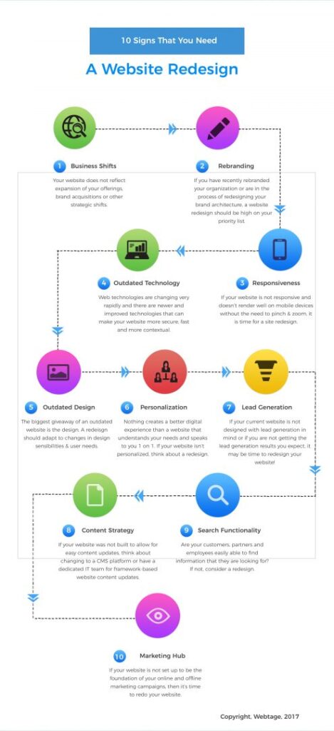
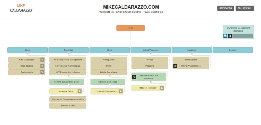
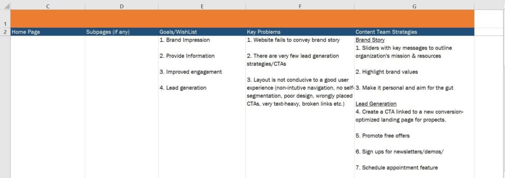
2. Audit your Website & Personalize Your Web Experience – Your website is the foundation of all your online and most offline campaigns. Consider this: 81% of your prospects go to your website to “check you out” before they even think of contacting you. Your website is your online office-front and what’s more important is that 51.3% of your prospects will rule out a firm before even talking to them. (Hinge Marketing, 2015). So make sure your website helps you put your best foot forward, makes it easy for visitors to find the information they are looking for and is designed for conversions.
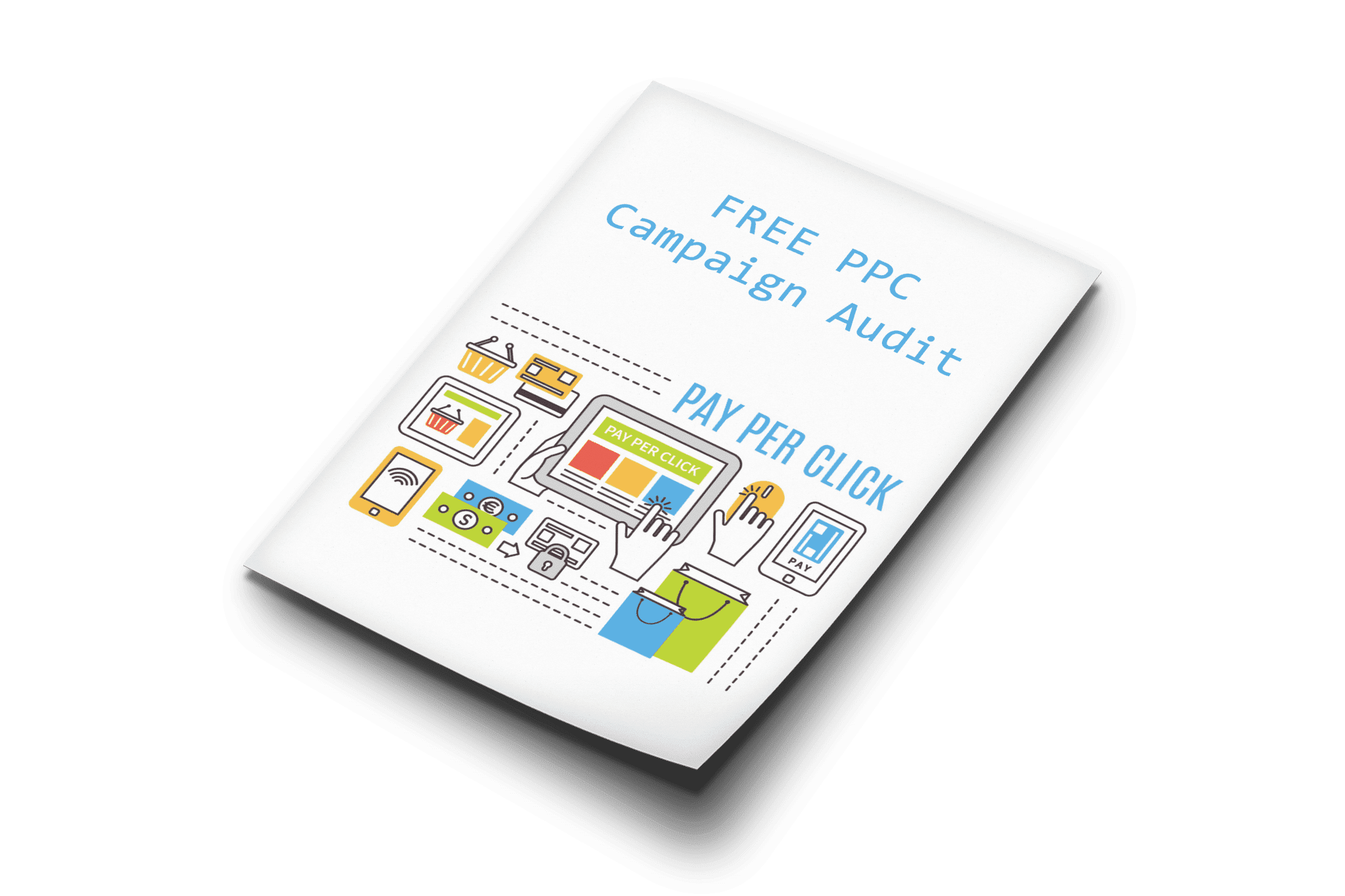
Need help with website audit? Download out easy 8-Point Website Audit Checklist here.
Key Takeaways – Integrate a Personalized Web experience and work on Conversion rate Optimization.
3. Evaluate your Marketing Campaigns – This is a no-brainer. Pour over conversion metrics by traffic source (traffic & engagement, no. of leads, no. of conversions, cost-per-conversion, lifetime value of conversion, bounce rate & exit pages). Evaluate your best & worst performing sources.
Key Takeaways – Take one lead source at a time, optimize returns, then move on to the next source.
4. Create Immersive Content – Content is king but customer is God! The way you truly reach and engage your customers is by creating content that they will like, enjoy and use. With endless streams of content from virtually every brand – some good, some bad and a lot ugly – the standard content strategy of consistent, useful and mapped content is not enough.
Key Takeaways –
- Invest in live video streaming – Customers saw the popularity of live streaming video in 2016 and marketers saw high ROI associated with it.
- Immersive Content marketing is on an upswing – As Forbes notes, “Users are also craving more immersive experiences, giving them the feeling that they’re doing more than staring at a phone or laptop screen.” If Augmented Reality (AR) and Virtual Reality (VR) is too experimental for you, try other immersive content experiences, such as live webinars and 360 degree video experiences
- Create dense content and scrap catch-bait content – It’s better to not create content than to create mediocre content. Create content that is grounded in specificity and not in generality. Let consumer usability guide your content creation and not search engine algorithm technicalities. Don’t forget good SEO strategies when you publish your content though. Add alt tags, add descriptions and instead of stuffing your article with keywords, try semantic search phrases that fit in naturally with your topic and context.
5. Invest in Contextual, Native Advertising – Native advertising is inherently a non-disruptive form of paid advertising that is “in-stream” and mimics the context, content and layout surrounding it on the publisher site. Think Facebook ‘Sponsored Stories’ that appear in your newsfeed that closely match your interests, intent and/or browsing behavior. Since this form of advertisement is nondisruptive (since it complements your browsing patterns and interests) and aims to be less obtrusive than traditional non-contextual banner ads (the conversion rate of native advertising is significantly higher than that on traditional display advertising.
Native advertising is only bound to grow. Consider the following statistics:
- Native advertising click-through rate on smartphones is an astronomical 0.38% compared to 0.08% for traditional display ads.
- Most individuals want to learn about products through content rather than via traditional advertising
- The average click-through rate of premium native ad content is now 137 percent higher than on desktop and this differential is expected to rise with the widespread adoption of AMP and Facebook Instant articles.
- Native advertising will generate 74% of all U.S. display ad revenue by 2021.
Key Takeaways – Introduce native advertising into your digital marketing mix. Many in-feed publisher platforms exist, such as Nativo, Taboola & Outbrain. A new player on the block is Wayfare Interactive which offers native, contextual ad units for online commerce. Or try native paid ad listing options from well-known brands, such as Facebook, Twitter, Instagram, Amazon, Etsy, Yelp.
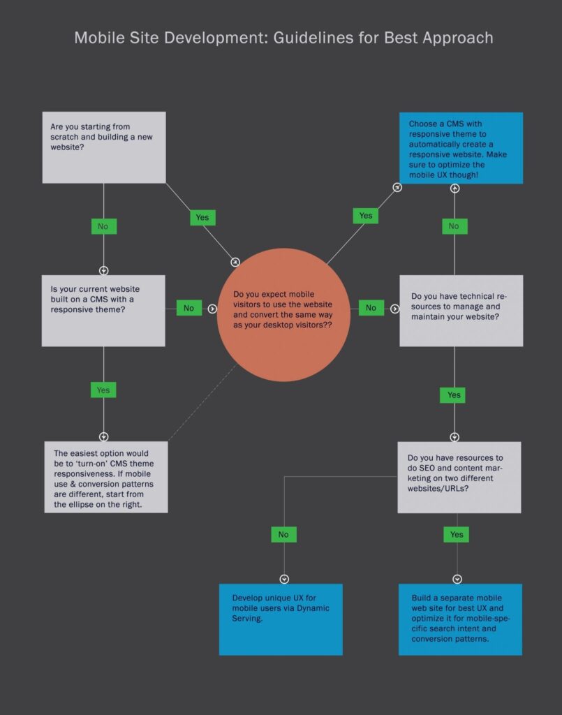
6. Step Up Mobile Marketing – As mobile search overtook desktop searches in 2015, digital marketers need to adapt to a mobile-first digital world. Mobile advertising is increasing its share of total advertising rapidly as marketers see improved conversions from mobile compared to desktop advertising.
US mobile ad revenue will rise by a 26.5% CAGR through 2020 while US mobile ad spend will correspondingly increase by a 25.2% CAGR. Desktop revenue and spend will decline in the same period.
Key Takeaways –
Step one: make sure your website is mobile ready. Next, enable enough SEO-specific content on your mobile site as Google recently announced that it will now use your mobile site for primary indexing.
Step two: Target your existing ad platforms for more mobile views and better mobile conversions. It could as simple as enabling the Call extension which allows users to simply click on your phone number displayed in the ad, reducing the number of clicks required for conversion.
Step three: Explore more specialized platforms, such as AdMob, Google’s Mobile ad services or TapIt for hyper local mobile targeting.
7. Invest in Data Analytics – At the end of the day, your marketing effectiveness will only be as strong as the insights you can gather from the rich data provided by your campaigns. Ensure the help of BI tools and trained analyst to sift through the data noise and produce valuable information about the market.


