Higher Education Web Strategy, UX, Content, & Design
ABOUT
Establish Value Add Of Student Services, Improve Resource Utilization, & Improve New Student Recruitment
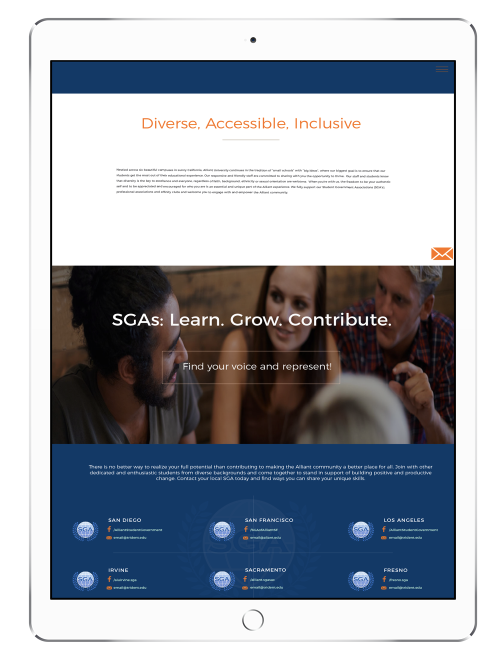
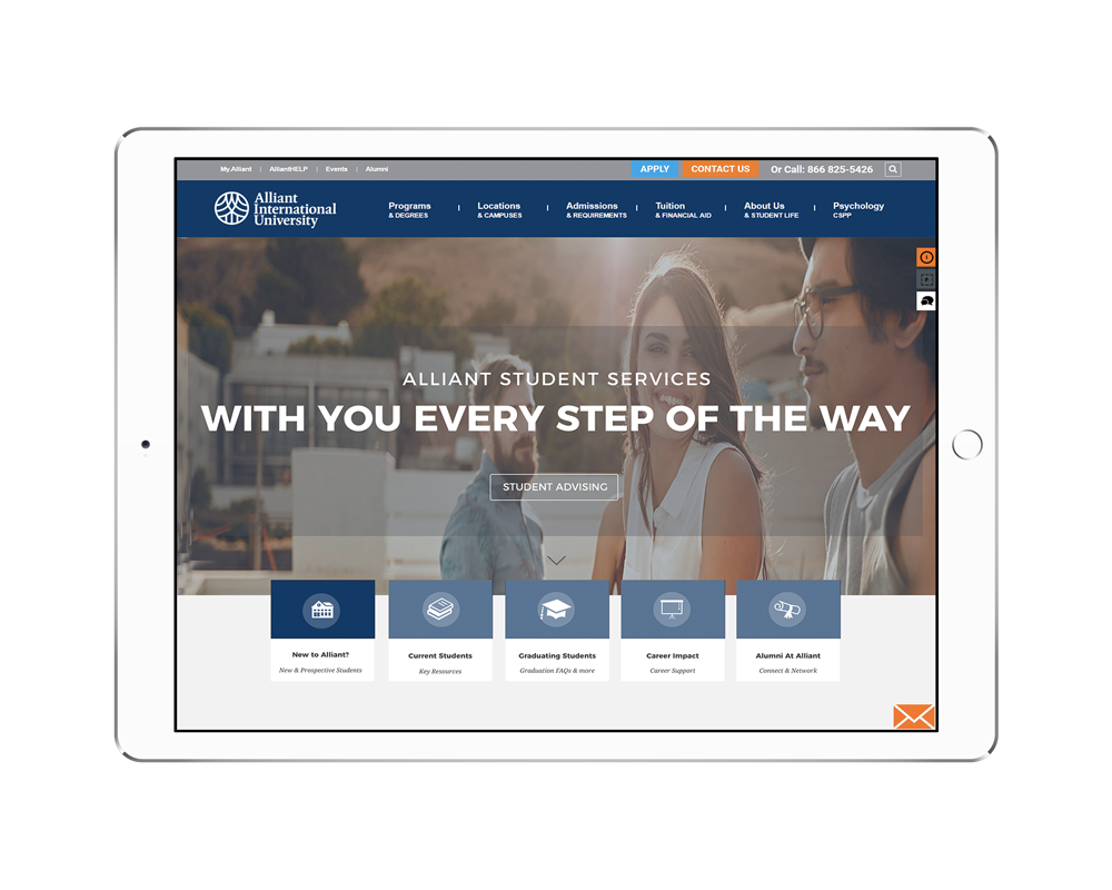
The Student Services division of Alliant University was looking to create new and actionable content for its microsite with the goals of promoting the university to prospective students and help new students quickly and easily find the information they are looking for by creating self-segmenting navigation. Webtage designed and developed a new microsite that:
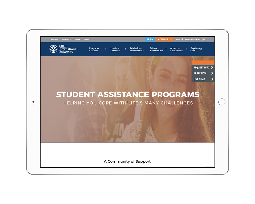
- Clearly conveyed the rich and valuable resources that Student Services offers its student body.
- Established Student Services as a valuable partner in enriching the student body experience at Alliant.
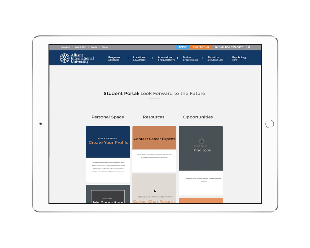
- Helped students quickly and easily find the information they were looking for by creating self-segmenting navigation.
- Eliminated problems of broken links, lifeless content, and confusing architecture that existed on the website.
- Enabled personalization of Student Services through staff & student profiles.
In the process, we also helped promote Alliant University to prospective students by creating a New Student landing page with streamlined information, strategic positioning, and highlighting value propositions.
Nuanced Brand & Story
We carved out a local niche by developing include a visual brand identity and brand positioning, while staying consistent with the master brand.
Investor Collateral Development
Website & UX Design was strategically developed to project a mature brand and generate marketing qualified leads.
Thought Leadership Content for Brand Marketing
We then developed top-notch, well researched cutting-edge manufacturing solutions blogs, PR articles and social media content for brand marketing.


Actionable Content and Improved UX for Resource Utilization
Website Audit & Strategy included top-level goals & wish list, current problems, and content strategies. Top-level analysis combined with a deeper content audit allowed for a strategic navigation structure.
Experience Redesign for Increased Engagement & Improved Conversions. Improved brand story, effective site architecture, and self-segmentation all worked to improve resource utilization, and worked to improve conversions of prospective students.
Content Creation, visuals, and layouts worked to make the information streamlined, appealing, and accessible. Elimination of sterile verbiage and addition of personalized content created an affirmative bias in the visitor.
PHASE I
Website Audit & Web Strategy
Website goals & wishlists were created from user stories and key stakeholders. Next, a top-level website analysis was done that was mapped to goals and key problems to create a content strategy.
With the information gathered above, we listed the primary KPI and secondary KPIs for the website as a whole, and individual pages as well.
After having established clear KPIs based on a content strategic overview, we next moved to a complete site content inventory audit. We relied on the automated sitemap with self-populated content fields as well as manual assessment of content needs.
We create a new sitemap aligned to strategic goals of the content redesign project and user needs. Like a good navigation strategy should, we took our cues from expected user navigation patterns and allowed for intuitive, self-segmentation of users.
Lastly, we decided on the brand tone of Alliant Student Services and took organizational, hierarchical, and cultural contexts as well as brand guidelines in mind to take the website development project to the next level.
PHASE II
Experience Redesign for Increased Engagement & Improved Conversions
- Improved Brand Story: Smart Design with brand story telling to invite users in via interactive features & brilliant copy.
- Effective Site Architecture – Simple, direct, unadorned, visual navigation replaced text heavy hyperlinks & confusing architecture.
- Sticky Calls to Action – Lead generation through strategically placed but unobtrusive CTAs.
- Self-segmentation – Easy self-segmentation to lead users to most relevant experiences.
PHASE III
Content & Design Brings the Website to Life
After creation of the sitemap, we created the visual, low-fidelity framework. This is where organization of content happened and the layout was finalized. We kept user experience at the top of our priorities when designing the layout.
We next created the verbiage, which is the actual meat of the project and involves creation of copy well aligned to the KPIs, SEO needs and most importantly user needs. The Alliant Student Services brand came alive at this stage.
Low fidelity and content were merged to create high fidelity mocksups. The content, mockups, and detailed functionalities were then handed over to the development team that took the site live.


