Mobile-First Indexing and Mobile Site Performance Optimization – A Checklist

With the recent mobile-first index announcement by Google, mobile site optimization needs to be taken more seriously than ever before. As Google, rightly so, looks to mobile sites first for search engine indexing and ranking, mobile site SEO strategy, mobile content and user experience has become critical to digital visibility.

Standard UX Enhancements:

In order to bring visibility to your mobile site, first start with standard mobile UX enhancements such as:
 Improved site speed by reducing bandwidth – Eliminate render-blocking JavaScript and CSS in above-the-fold content, optimize images, leverage browser caching – for starters.

 Remove floating elements (which do not render well on mobile devices)!

 Adjust font size and accommodate the “fat finger”

 Use mobile-friendly navigation patterns (drop downs that appear on hover are a bad idea on mobile sites).

 Make menus short.

 Reduce number of hyperlink texts in the mobile site to prevent accidental clicks.

 Keep headlines and body copy short, effective and relevant.

 Eliminate flash that does not render on iPhones and is slow on Android.


Conversion Optimization features:
 Map conversion paths for mobile devices and associated UI elements.

 Add geo-locators and contextual keyboards to provide a richer and more relevant individual experience.

 Add clickable phone numbers.

 Make Calls-to-Action Prominent by featuring it in the most prominent space on your mobile site.

 Be Available – Add Click-to-Call buttons for complex tasks.

 Keep forms simple and fields down to a bare minimum required.

 Reduce the number of task actions to a minimum – no more than 2 to 3 steps to get the user to convert.

 Add social proof.


General SEO Elements (mostly applicable for parallel mobile sites, but some elements are relevant for responsive and dynamic serving sites as well):

 Define goals and success metrics before developing an SEO strategy.

 Research mobile use patterns and intent of users.

 Add geo-specific and mobile specific keywords to optimize your mobile site for location-based searches.

 Reduce dead ends.

 Use concise but useful page titles META descriptions to work with the small screen space limitations.

 Use mobile-friendly URLs.

 Use canonical tags to signal that your mobile and desktop are two versions of the same business.

 Finally, track mobile site analytics to track visits, bounce rates and conversions – If metrics fall short of goals, trouble-shoot possible mobile UX conversion roadblocks.


New Mobile-First Indexing Optimization:

Other than the basic, common-sense SEO strategies mentioned above, there are some specific SEO strategies that should be implemented to meet the requirements of mobile-first indexing, as the primary ranking signal will now come from your mobile site and not your desktop site:
 Ensure your structured data is set up on your mobile site.

 Make your mobile site content rich and SEO friendly. Many dynamic serving and mobile sites can suffer from too less content or content not optimized for search engines.

 Speed has become more important than ever, as slow-loading mobile sites are abandoned faster than ever, as our attention span has dipped below goldfish-span levels. Optimize images, leverage browser caching, and enable AMP (Accelerated Mobile Project) pages on your mobile site.
o (NOTE – Even though these lightweight web pages are not likely to boost page rankings in any significant way in the near future, and Google has indicated that it will index desktop pages over AMP pages, if no alternative mobile site exists, at the very least AMP pages will improve user experience and reduce speed load significantly – both positive boosts for search engine rankings).

 Focus on local search has become more important than ever. 4 out or 5 searches on search engines are local searches. Ensure your mobile site is optimized for local search.

 Stop redirecting desktop pages with no mobile equivalent to the mobile home page. That will ensure that those desktop pages are not indexed as Google will first index mobile pages unless there are no mobile equivalent for desktop pages, in which case Google with index desktop pages.

What has helped you achieve top visibility for your mobile website? Drop us a line at info@webtage.com or comment below to let us know!

Considering a New Mobile Website? Here’s What You Need to Know Before You Start

It’s official: Mobile searches have overtaken desktop searches in 10 countries, including the U.S. and Japan. The rapidly expanding mobile-first search world has led Google (with Bing not far behind) to tweak its algorithm to favor mobile optimized sites for search rankings – the so-called “Mobilegeddon.”  The message is clear: As users and search engines favor searches on-the-go, Google is committed to providing an optimal mobile experience and neglecting mobile could mean the inevitable – loss of search rankings and eventual loss of new business.

As a savvy business owner you probably know that having a mobile website experience is important for search rankings. But it is important to carefully craft a mobile strategy that is performance-driven and responsive to your consumers’ on-the-go search behavior.  So how should you navigate the mobile-first world? Before you decide to take a first-step to establish your mobile presence or are interested in evaluating your mobile presence, here are some useful mobility guidelines:

Mobile Configurations

If you have explored mobility solutions, you have probably heard that there are three different configuration approaches to build a mobile presence:

  1. Responsive Design
  2. Dynamic Serving
  3. Separate URL

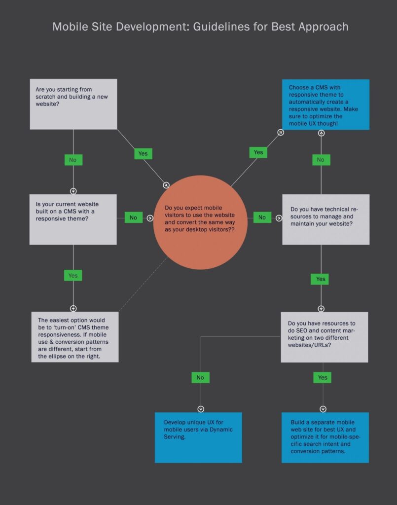
 Responsive Design has become the holy grail of mobile site development where content from the main website is resized and repositioned to best fit all screen and devices. Responsive Design, however, may not be the best option for you especially if you expect usage patterns and conversion paths to differ between your desktop and mobile users.

Dynamic Serving allows you to serve different user experience on the same URL, based on the type of device that’s requesting the page, thus creating a mobile UX relevant to your on-the-go customers. Use the Vary: User Agent HTTP header for pages that serve dynamic content based on device or that redirect to device-specific URLs to signal to search engines that website content will change based on user agent (device) that requests it.

Separate Mobile site is a great option to create a completely different mobile site and host it on different URL to deliver a highly specific mobile user experience and optimize for mobile search intent. The mobile URL can be a subdomain (m.domain.com), a subfolder (www.domain.com/mobile) or an entirely different domain (www.mobile.com).

So which configuration is best for you?  (Click The Thumbnail Below to View Full Size)

Best Mobile Configuration Method - A Flowchart
Best Mobile Configuration Method – A Flowchart


Task-Centric Site – Before you decide which approach is best for you, understand your target audience and their mobile behavior patterns. Consider tasks they are most likely to perform on your mobile website and design the site to ease smartphone task performance.

Understanding their behavior will not only help you create relevant UX, design and content but will also affect the method you use to build a mobile site. If there are significantly different use patterns on a mobile and desktop site, consider a Dynamic Serving website that can render a completely different UX under the same URL. Having the same URL also means you save on SEO costs, although you can tailor the mobile page content for some mobile search intent. A separate mobile site will also work well to serve different use patterns of customers, but entails significantly more technical and marketing resources.

Website content – Is your website content heavy? Will your customers be served well by serving the same content to mobile users or do you want to restructure your site architecture to break a long, single page content into several pages? If it’s the latter consider developing a separate mobile site. Alternatively, if you choose the responsive approach, analyze whether the bandwidth-heavy content can be turned off for responsive mobile sites.

Technology – Mobile specific web pages provide the ability to integrate specific properties of mobile devices that can be used to improve user experience. For instance, the ability to tap in geo-location, cameras and phone can vastly improve user experience. Think Chase mobile site and app that facilitates online deposits by taking pictures of checks, or the ease with which Shutterstock’s customers can click and upload pictures to create personalized cards and stationary, or Google mobile site that uses geolocation to find the best Mexican restaurant near you, if that’s your search intent! Whichever method you use to create a mobile experience, make sure you use the best of mobile technology mapped out against your user needs.

Search Intent – Are your mobile users looking you up with an intent to perform tasks that are different from your desktop visitors’ tasks? If yes, responsive design may not be the best option for you. While a Dynamic Serving site will allow you to optimize the on-page content and layout to target specific keywords, a separate mobile site is the best way to go to aggressively target search intent through building quality backlinks for mobile-specific search words.

[mk_page_section bg_color=”#1092c3″ border_color=”#1092c3″ bg_stretch=”true” enable_3d=”true” speed_factor=”4″ sidebar=”Service Sidebar”]

Ready to start creating optimal mobile experiences for your on-the-go audience? 

Click to download our Friction-free mobile experience design checklist.

[email-download download_id=”2″ contact_form_id=”8305″]

Contact us at info@webtage.com to schedule a FREE consultation on your mobile strategy.

[mk_divider style=”padding_space”]

Webtage - Digital Marketing Specialists

[/mk_page_section][mk_page_section]

About the Author

[mk_circle_image src=”https://www.webtage.com/wp-content/uploads/2017/02/snigdha_circleprofile.png” image_diameter=”150″]

A believer in hype-free and performance driven digital strategies, Snigdha’s endeavor is to get your brand established and your business grow. She is passionate about research, design and analytics and works non-stop and meticulously to make sure that your brand stands out from the rest.

Snigdha’s background is in research design, industry research, content creation, and qualitative and quantitative research (including web-based and phone survey methods and focus group discussions). She is a highly qualified professional in the areas of digital marketing strategy design, SEO, content creation, and social media marketing. Most recently she has grown a client’s online presence from zero to 25% online leads within 3-6 months; moved client website to the #1 & #2 spots on Google, Bing, and Yahoo for all major keywords; and generated online leads accounting for 25% – 30% of all leads for that client.

Contact her at snigdha@webtage.com

[/mk_page_section]

Building an App? Be Sure You Start on the Right Foot!

If you are reading this, you have already figured out that mobile is fast becoming a primary channel to drive content and services to consumers.  And if you are planning to create an app to reach out to the growing audience on-the-go, it would serve you best to follow these key strategic steps to avoid costly mistakes later. We are assuming you have spent time validating your idea through market research and have a monetization plan in place.


Think Detailed & Ahead – A great app starts with a great concept. Start by noting down just what you expect the app to do. This could be a simple bullet point document on high level function that you expect the app to perform. The next step involves creating detailed product specifications and full-featured product description. To do this best, think ahead and plan before.

For instance, if you are developing an app to book local cab service, think about how you would want subscribers to register for the app – via phone or email? This would be guided by the national geography you are targeting, general industry trends, but also by how you plan to notify users about appointment confirmations and changes. If notifications and communication is planned via SMS, then phone number should be the primary registration, identification, and verification field. If email is the way you would want to communicate with end users, require an email field for registration purposes.

Many other similar decisions will be critical for the viability of your app.  Consider hiring app consultants for this crucial phase who can provide the foresight and experience to guide you in the right direction during the design phase, so that you do not waste resources reinventing the wheel.


Brand it!  The look and feel of your app has an overwhelming impact on app downloads and consequently, monetization. Usually relegated to the backbench by many app development firms, we cannot overemphasize the importance of branding in connecting with the consumer and building trust. Quoting Tom Leclerc of Wooga.com (the creator of the hugely popular Jelly Splash): 

“What a lot of app developers and publishers may not know is that retaining users starts before a download happens.”

Branding done right is instrumental in building trust and relationship with clients, plays a critical role in app store and Google Play Optimization, and guides effectiveness of marketing and advertising campaigns.


Great UI is Crucial – Put your customers first. Listen, read, and understand the pain points of your consumers. The functions and features of your app should be driven primarily by what consumers are looking for or even exploring latent needs of your target audience and not the latest hot technological tools and competitor feature set. Spend time developing user case scenarios and flows in the user interface design phase. Good user interface design does not simply mean designing attractive data objects and layouts – it means developing effective user personas, creating user case scenarios and user flows, and integrating those into the user interface design.

Your feature set and UI should be guided by these two basic principles:

  1. One, your app simply exists to resolve your consumer key pain points. Do not be tempted to integrate “cool” features just because you’ve discovered hot, new technological tools that could bring the coolness factor in.
  2. Two, you app should be so easy to use that it takes minimal effort on part of the consumer to figure it out. If a consumer needs to be walked through an app, you’ve lost the battle!


Phase it Out – A wholesome app with all desired features in version 1.0 may sound like a great idea. The opposite is actually true in most cases.  App creation works best from a long-term viability perspective if done in an iterative fashion rather than in a linear fashion. The main advantage of the iterative application development (IAD) is that it assigns equal importance to users and developers and user feedback is incorporated into each and every iterative phase. This results in better understanding of real user needs, quick identification of problem spots and bottlenecks, and fast resolutions thereby creating a better product. Complex app systems are also clearer and easy to implement if done in an iterative fashion.

So make sure you break up your complex app system into phases by prioritizing functions and features. That way, you will not create a behemoth of a software only to discover that key user needs have been left out, or worse still that users find the interface difficult to understand or that the app requires too much effort to use that leads users to drop out or uninstall the app.

Integrate Marketing Into Design – We all like to think, as entrepreneurs and visionaries, that we have discovered the next big thing and consumers will queue up to try out our app. In reality, our brilliant app concepts will need a liberal dose of help from outstanding marketing initiatives. A good place to initiate your app marketing is – you guessed it – right into the app design. Most effective marketing happens when users generate content, in the form of social shares, reviews, feedback, and general intera­ctions. Make sure you have features within the app that allows users to communicate with their social communities and with your team! The kind of features you offer should also be guided by your strategic marketing plans.


Contact us for an initial consultation to help you build a successful app development and monetization strategy.