BLOG
Make Your Higher Ed Website Modern, Personal, and Effective by Avoiding These 10 Costly Mistakes

In working with various higher education providers and legacy institutions, we have come to learn that websites have emerged as the leading tool in the admission and marketing toolkit to draw in prospective students especially qualified students who will also tend to retain better with positive academic and career outcomes. In that sense, the website is the first point in the virtuous circle of lead to advocacy.
Students are increasingly using the web to evaluate and choose a college. However, despite the critical role that websites play in their ability to drive choice, higher ed websites are notorious for being clunky, impersonal, and confusing. Part of the problem is higher ed websites tend have sprawling site architecture with thousands to sometimes millions of pages. Bringing order to the sheer size of the site can be daunting task, not to mention the multiple user behaviors and preferences that the site must cater to. The mistakes, however, are easy to spot. Here are ten most common mistakes that higher ed website redesign teams tend to make:
- Over focused on Admissions and Enrollment– Websites for higher education are increasingly driven by the enrollment team and are overly focused on their applications and enrollment goals. Prospects on the other hand are thinking beyond admissions into student life, co curricular and extra curricular opportunities to get a glimpse into student life. Websites are woefully lacking in delivering content and user experience that a prospect can use to imagine his/her life at the college.
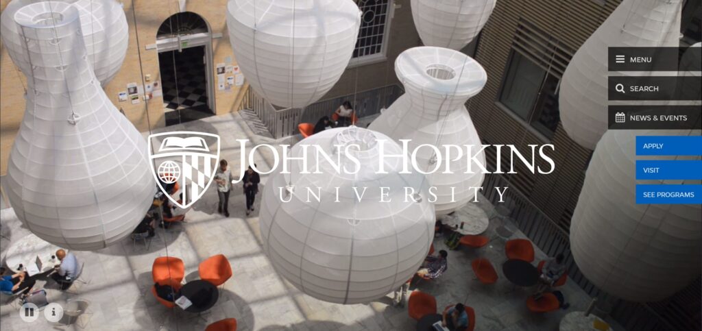
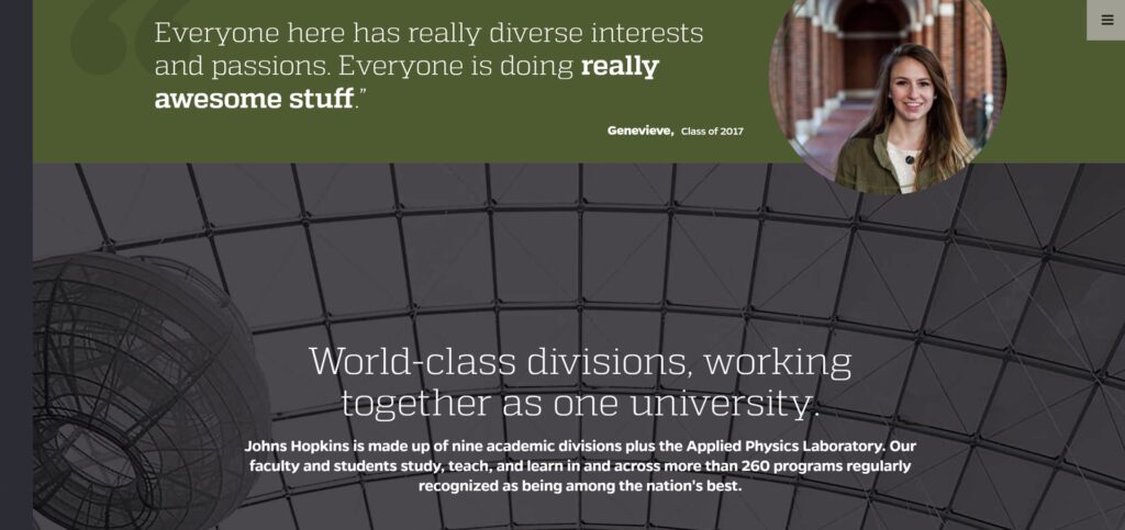
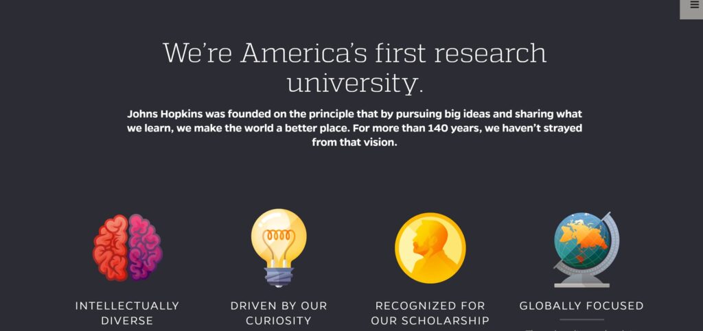
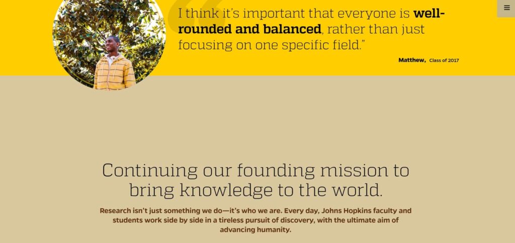
Who Got it Right? Not all high-ed websites fall into the trap of admissions and enrollment goal overzealousness. The Johns Hopkins website does a commendable job of not only telling their ‘brand story’ but also highlight school philosophies reinforced through student profiles.
2. End game focus is here to stay– Only a handful of the 20,000 or more higher education websites really address the “What will be life like after I graduate” question. Only a few provide program specific career links and current data from BLS and other projections. The alumni tab is not enough to provide students with a look at their future selves!
Who Got It Right? Stonybrook, North Central College and the University of North Carolina School of the Arts do a great job of highlighting Alumni profiles to prop up post-university opportunities.
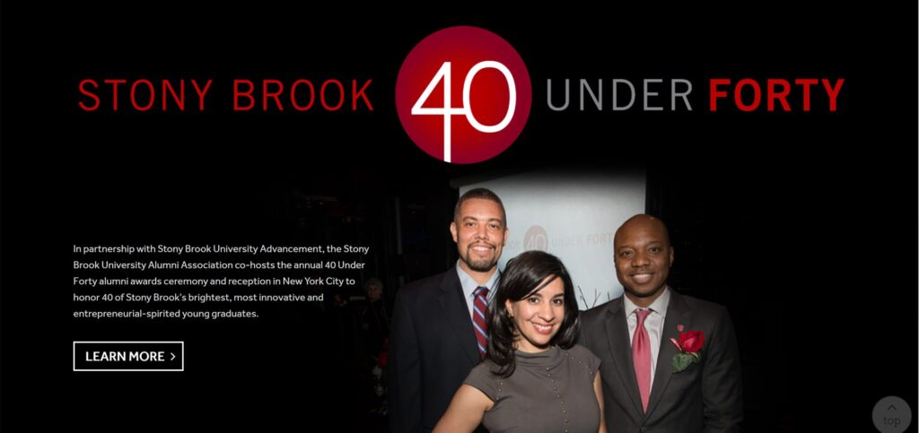
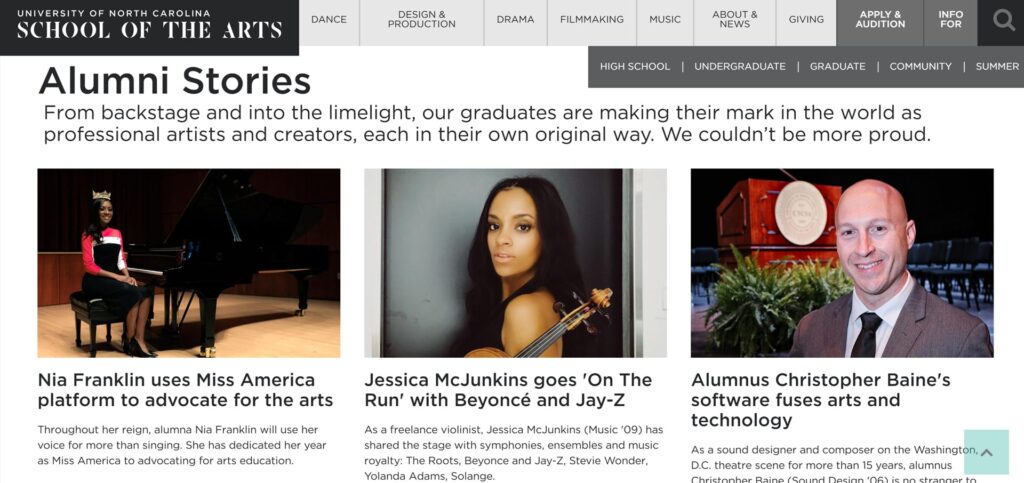
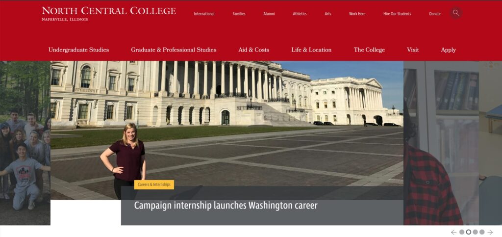
3. Mind over heart – Webtage’s audit of over 100 websites showed a shocking lack of emotion and personal touch. How about a professor or a counselor making a personal connection through the site? Students want to study from and spend time with people not institutions!
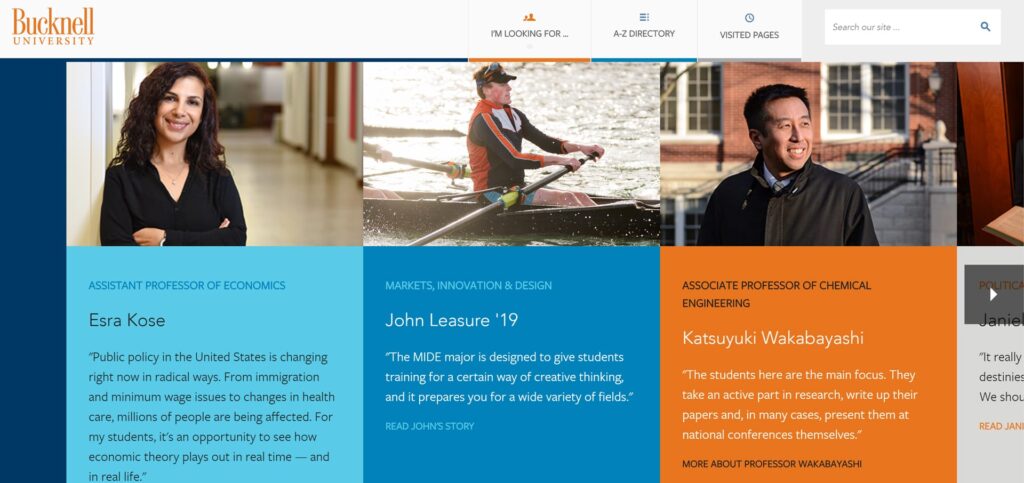
- Who Got It Right? Bucknell, one of our favorites, got it right by putting faculty voices front and center on their home page.
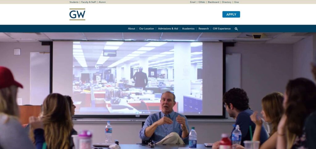
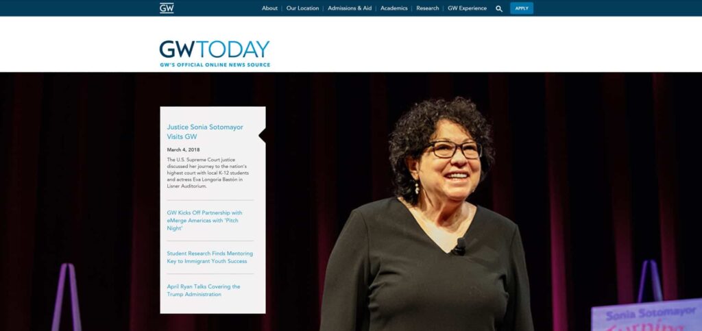
George Washington University also offers a personalized experience through wide-shot and close-up videos and images of faculty and honorable guests.
4. Lack of simplicity/transparency – Many college websites bury answers to the top 5 questions relating to admissions, cost of attendance, outcomes, student life and graduating requirements in such a complex maze of content instead of tackling these in a transparent and straight forward manner.
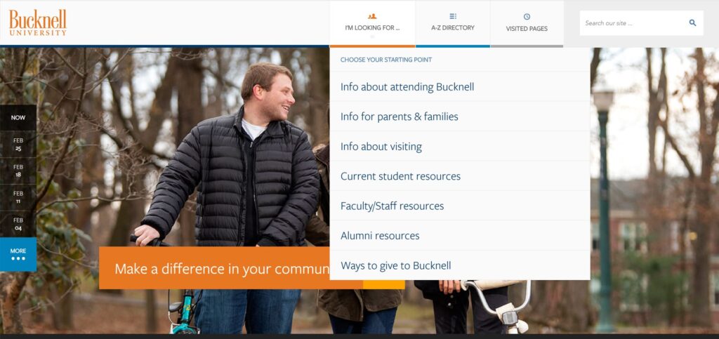
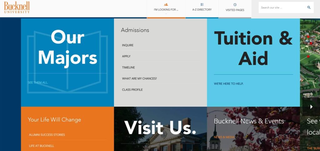
Who Got It Right? Bucknell University made the cut again. We’re very impressed by Bucknell University’s navigational ease in providing sought-after information to audience segments.
5. Comprehensiveness over user experience: Website for a lot of colleges are over a 1000s of pages deep!! This is in total contrast to the twitter culture where consumers expect to find information/form an impression in as little time as possible. The worst sites are the legacy sites which have simply added on more content as needed sacrificing the user experience completely. It is risky to assume that “if they need it, they will find it” is a way to define user experience.
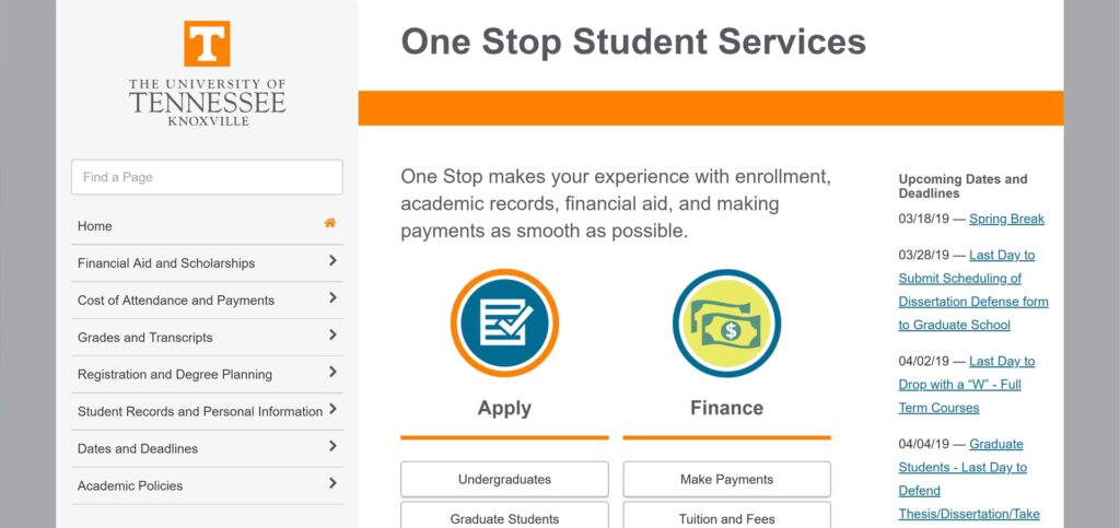
Who Got It Right? The University of Tennessee at Knoxville One Stop Student Services uses a simple layout and unadorned navigation to provide a wealth of information to students
6. Tradition versus dated : The age of the college doesn’t have to show on the website user experience! A 200 year old college does not have to offer a “dated” user experience to communicate the tradition and experience.
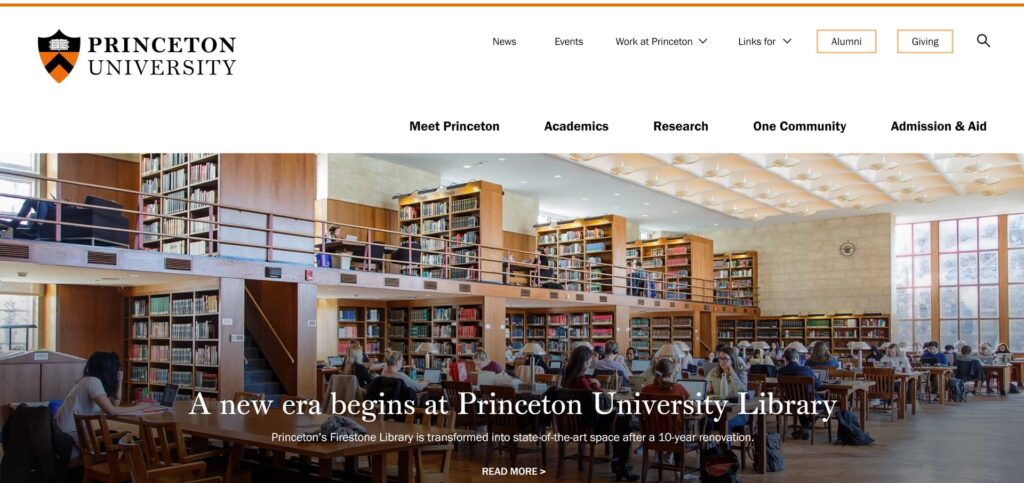
Who Got It Right? The 273 year old Princeton University has a website that is fresh, clean, and modern and still packs a punch by giving viewers a clear sense of their ethos, their commitment to keeping up with the times, and a ton of key information neatly organized.
7. Foggy pathways: For colleges that have programs that lead to licensure/certification – it is a missed opportunity to not show the pathway to achieve that licensure. Many progressive colleges are now including the steps to the licensure in their program/service so that they are a one stop shop. Short of that, at least the websites can provide clear pathways and third party links that can bridge the knowledge from graduation to certification.
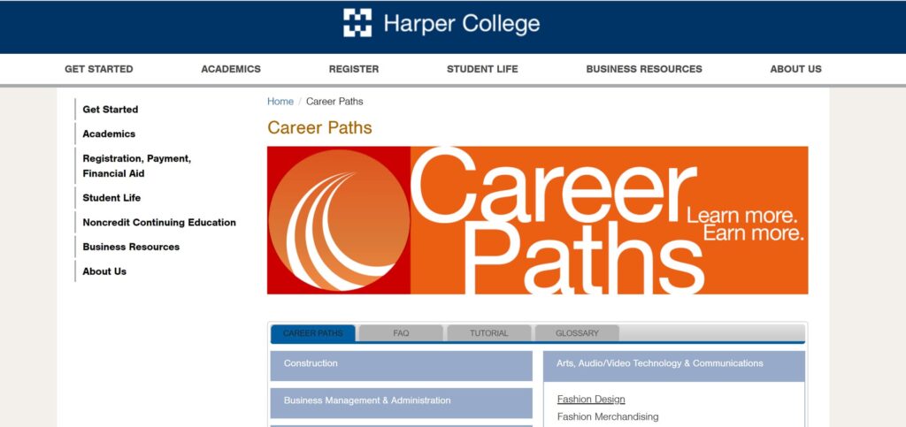
Who Got It Right? Harper College, in our neck of the woods, has created a simple and simple and easy to navigate career pathways landing page for its students. We love the interactivity it offers in contrast to the text-heavy career pathways page on most other higher ed sites.
8. No (N) traditional students: Almost all colleges want the non traditional students for their onsite or online campus but the websites are an extension of their lack of clarity on what these students want and their barriers/anxieties. Many websites just use diverse student images to satisfy themselves that their site addresses the non-traditional student but the reality is that these students have very distinct concerns and anxieties.
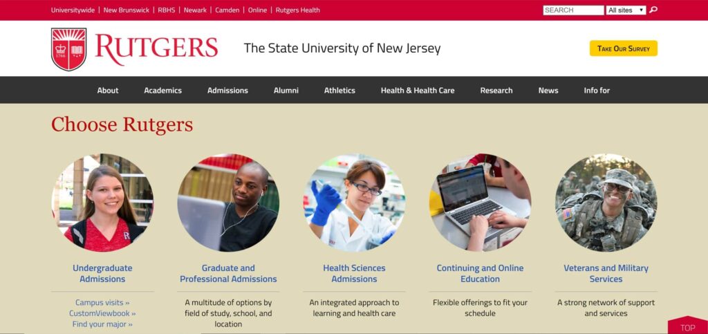
Who Got It Right? Rutgers has a spotlight on their active military/ veteran students as well as continuing education and online programs on their home page that allows for good targeting and intuitive self-segmentation for the non-traditional students attending a traditional university set-up.
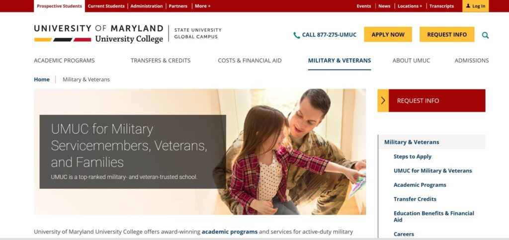
University of Maryland at University Campus also does a great job with a landing page for military/veteran students with a lot of useful information organized neatly into a side navigation.
9. Underleveraged Assets: Any college or university has faculty or other assets that could be powerful in search engine optimization ( SEO) but because these are not tagged properly or recognized, they remain under-utilized.
10. Lack of enough program level differentiation: Most universities are beginning to answer the question “why them” and develop a somewhat distinct identity/voice. However at the program level, higher education is becoming increasingly commoditized. The website is a great place where using the Less is more principal- the program can be differentiated in how its CLO or PLO are defined or how the capstone project is to be completed. Typically, we work closely with the Dean or the Program Director to define the program level positioning.
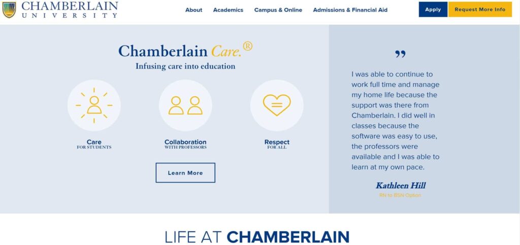
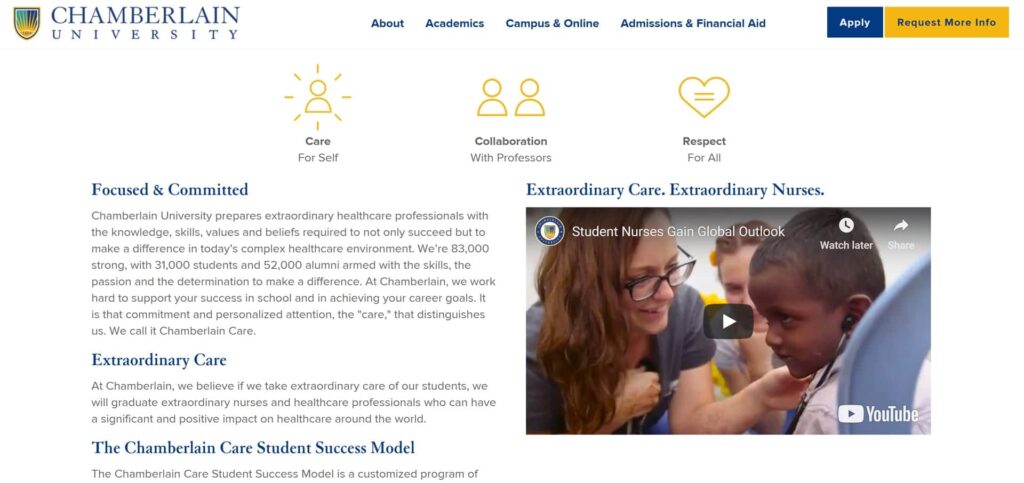
Who Got It Right? Chamberlain College of Nursing has well activated its program positioning on its website through effective brand voice, content development around careers, spotlight on nurses and tips for students.
Redesigning a higher education website is a more than a technology migration or marketing communications initiative. It is truly about delivering a user experience that is relevant and compelling enough to drive choice and ease of use for all users.
Which higher education websites do you like and why? We’d love to hear!
We are an award-winning digital build and market firm that brings a research-based approach, technical sophistication, marketing ingenuity, and creative thinking to innovative web solutions that bring consistent returns on digital investments.
Our digital build & market experience spans multiple industries, but our strongest strengths are B2B/technology, higher education, healthcare, B2C, and professional services. Our clients achieve sustained visibility because we build online campaigns the solid way.
Contact us for FREE 1 Hour Web Consultation
Schedule your free consultation today to discuss how our website technlogies sercices can benefit your enterprise.
Get in Touch


 LINKEDIN
 FACEBOOK
 TWITTER
 INSTAGRAM